Wednesday, July 13, 2011

Master Bedroom

The master bedroom is still a work in progress.  I'm still unsure of what to do with the window treatments.  For now, the ones are still up from when we moved in because they provide privacy at night.  During the day, however, I leave them wide open.

 Here's the view when we first closed on the house!

 Um, here is the view when we moved in!  As you can see, crap got put everywhere!

Then as you saw in the library post, the wall got built. (the doors on the left are for the closet)


It was pretty much bare for the first year.  We didn't have a proper bed, just mattresses on the floor, and we didn't have any artwork hanging up.  I did paint the walls a dark greyish purple.

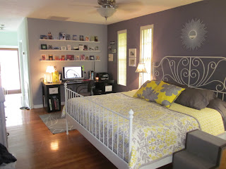
Here is what the bedroom looks like today:

 The bed, rug, office chair, and white frames are from IKEA.  The bedding and sun burst mirror (no longer avail.) are from Target. 

 That is a futon along the far wall, we will eventually be giving that to my sister when she gets her own place.  I'd rather another dresser go there, so that Phil and I can have more room for our stuff. The quilt on the futon was made by my great grandmother.

 On the far wall is my desk (IKEA) and postcard shelves that Phil hung for me.  He made them out of 1x2's.  The idea came from YHL.  In the bottom right corner you can see the puppy steps that Phil built for Riley.  You can also see on the left that we still have no bedroom door.  That door leads directly out to the pool.

 Artwork from Etsy.

 Artwork my mom bought from an art student and had framed.

Artwork by Dan Dos Santos.

There is still much to be done in this room.  Eventually I will figure out what I want to do for the window treatments, I think that will end up pulling it all together and make it feel more done. And I'm on the lookout for a cool side table for my side of the bed.  What you can't see in these pictures is the wall that we built.  It's painted, but we still haven't put in baseboards (have to get them specially made to match the rest of the house), and there is no electrical in the wall yet, so there are cords everywhere for our T.V.  I'd show you my closet, but it's a disaster ;)

Monday, July 11, 2011

Making a Headboard

I decided for the guest bedroom that I wanted to make a headboard.  I knew that I wanted it to be rustic to fit in with the bedding and style I was going for.  I wouldn't call it shabby chic, but more of a collected look.  After much contemplation, and even think about recreating a West Elm type headboard, I decided I needed some pallets.  Luckily, Phil's work throws them out sometimes when they break or whatever.   Here's how that process went:

This is what I started out with.  A full pallet and a broken pallet.
I decided to (have Phil) cut them up, because the nails in the pallets are so long, and have been in there so long they are almost impossible to remove.
Next, I laid out a pattern.  Then used heavy duty wood glue to put the boards on.  They are not heavy, so it was definitely enough to just use glue.  Then applied a white wash.  No pictures of the whitewash, but I ended up doing two coats.

Here is the finished project.  The bed isn't going to remain in this spot (I don't think) I want to hang curtains, but haven't gotten around to working with that corner window yet.

You know Elliott had to jump in for a shot.  He loves this room so much.  Whenever we open the door he runs right in and jumps on the bed.

The nightstand is from Home Goods and the bedding and lamp are from Target.  I need to DIY something for the shade or just get a new one...it's looking not so pretty.


Here is another shot of the room:


 The dresser was my great-grandmothers.  The mirror would normally attach, but the hardware was missing and the mirror was so heavy that I was afraid it would fall.  The milk bottles are from West Elm, the plant is from Target, and the candle came with the house when we moved in.  Obviously, we need to pull up the carpet in here as well, but we haven't gotten around to it yet.

Friday, July 8, 2011

Building a Wall

When we first looked at the house, we were told it had three bedrooms.  However, it only had two and they were small!  It did have a large living room/dining room combo, a huge entry room, and a huge den.  We figured that all we needed was to build some walls to make the den into a master bedroom.  It already had a bathroom and walk-in closet, so one wall and a door wouldn't be much work!

Soon after moving in my dad came over and helped Phil build a wall, dry wall it, and all that good stuff.  Here's how it went.

 I'm in the "entry" area looking into the den (or future master bedroom). The front door is directly to my right.

This picture is taken from the den (future master) looking into the "entry" room (future library).  In the middle of the shot is a doorway that leads to the living/dining room combo, kitchen, and guest bedrooms/bathroom.  The little cutouts look directly into the living area.  Don't you just love the curtains they had hanging to separate the spaces?

 Um, so my mom and I were cleaning/organizing the kitchen, so this is when I finally went to take a picture of the wall progress.

 They sure are fast! It's ready for drywall!

 Yay! Now for some sanding, primer, and paint!

 I chose the color "Warm Cup of Cocoa" for this room, because I wanted to feel cozy!  This is still the "entry" area, which has now been turned into...


A library!  We're not really sitting room people, and I'm definitely a book girl.  Obviously, you can see by my other blog (Brooke Reviews).  What better room to have when you first walk in (I'm standing with my back to the front door)?  I still need a few more shelves, and I'm thinking crown molding and a nice chandelier would look nice, too bad we'll need an electrician to install all the wiring stuff for us.  I'm also on the hunt for a round rug.  I'm sick of rectangles ;)

The only trouble in this room is lighting.  It has no windows, besides two small ones that flank the front door.  So this room relies on light seeping through from the living room next to it.  Maybe in the future a window or a better front door with glass can be added for natural light.

Pictures of the master to come soon!

Tuesday, July 5, 2011

Yucky Carpet

After living with carpet in our apartment, laminate and carpet in the townhouse, and wood, tile, and carpet in our previous rental, we knew that the carpet in the guest bedroom and office would not last long.  It was only a matter of time before Phil went to work ripping it out.  One day I was in our bedroom and heard a ruckus going on, when I went to inspect I found Phil tearing the office carpet to shreds! Gotta love that initiative!

Here's the before and after:


Ok, it's kind of a crappy before pic, but really it was just a box with a corner window and nasty carpet.  You can see the carpet down there trying to creep up into the picture!

Here it is after the carpet was pulled up and it received a good sweeping/vacuuming.  Looks a little rough, huh?
 
Here it is after a little elbow grease.  It's still not perfect and will need to be refinished eventually, but original hardwood floors are much better than crappy carpet!

Friday, July 1, 2011

Bathroom Reno

When we moved into the house, the main bathroom didn't have a shower.  This was something that needed immediate fixing, because with people coming over for swimming, house guests, and possible roommates a tub (however nice) wasn't going to cut it!


Here is the bathroom before, looking very white:


This is what was to the right of the above picture.  Built in shelving, nice, not so much if you would prefer a shower.


Off we went to Home Depot to pick out some not expensive tile, we weren't even sure what we wanted when we went.  Here is what we chose:


Usually, this tile is seen on floors, but we thought it would look nifty on the shower walls.  Plus, after much consideration, we liked the funky, keepin' it with the 50's style of the house.

So Phil and I (well, more Phil than me) got to work with the demo: 


I won't share all the demo pictures.  Nor will I share all the in progress pictures, because there are a dozen.  This tile was a pain in the butt, because of all the little pieces that needed cutting.  Here's how it ended up:


I painted the walls grey (as seen in the kitchen).  We considered going all the way to the ceiling; however, decided against it for whatever reason.  It could have been that we wanted to stay within a budget.  We're very happy with it. All of the plumbing is inside that nifty built in, and we went for a fixture that feels like a lovely spring rain. ;)

Here's a different view.  this is me standing in the tub facing towards the doorway (on the left) See, there was plenty of storage, no need for the open shelving in the bathtub.


Finished:


Shower curtain is from Target, and I decided to go for a simple piece of artwork over the toilet.  Hey, it gets a ton of views in there!  I got the artwork from Eyeful on Etsy (I have another of her pieces in the master bedroom).


The space between the picture and the toilet is not as large as it seems in this picture, not sure why it looks that way...must be the angle.  I would put something on the back of the toilet, but it has an odd slope that doesn't allow for things to stay.  I'd put books there, but some people think that's weird even though I don't. You'll understand more on that later.

There you have it, our on the cheap bathroom reno!

Friday, June 24, 2011

The (dreaded) Kitchen

Lets just say we were excited to get into the house and begin work, and we knew that removing the wallpaper in the Kitchen would definitely be a bad experience.  I guess we didn't realize HOW BAD.  The proof is in the pictures!

 This is the ceiling (you can also see the walls a bit) of the kitchen.  The fan had clear plastic blades.  Isn't it lovely?

The "black splash." Yes, they wallpapered the back splash, sides of the cabinets, and even the outlet covers!

Full shot, this is taken from the dining room.

Other side...

Seriously, the wallpaper took us over a week to remove.  Especially when it came to the ceiling, because there was a lovely surprise...

What is that plaid? Oh, just contact paper (from the 50's) under the wallpaper (from the 80's)! Imagine our surprise.

 Sorry, not the best shot, it's the only one I have for right now.  Painted the back splash grey. We will eventually replace the floors and put up an actual back splash, but this was perfect for now.

 Isn't that white ceiling nice?  We changed out the light fixture (thank goodness, there was NO overhead lighting in the kitchen before).  Also, got the new refrigerator for helping my aunt move, and painted the walls pale blue.  Counters, sink, faucet, oven/stove, and dishwasher will all be replaced eventually.  I'm thinking about removing all of the upper cabinets around the window, because it just blocks the view of the pool!


Wednesday, June 22, 2011

Pool: Before & After

Well, you saw the pool in the previous photo, so let me update you on that.  I don't want you to think we've let that swamp prosper any longer than we had to!

 As you've seen this is the before...

Little creatures living in it and all...
  
Getting the gunk drained out...
  
YAY! Phil admiring the size...


The surface refinished...

 53 hours later, we have a clean (and full) pool!


 The pool is quite old, the tiles are original, and Brian (our pool hero) told us the tile was in great shape so we didn't have to change it.  I'm glad we got to keep the vintage feel of it.  Overall, it took about 3 weekends to get this pool read for swimming!